A system across formats
The same palette and typographic hierarchy connect reports, slide layouts and digital graphics.

i4cp / Brand systems
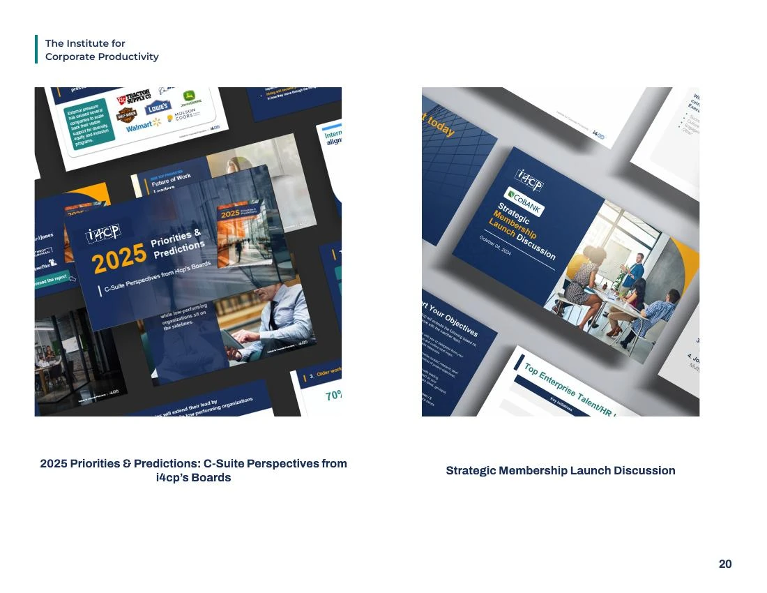
A brand earns its consistency in the details: the report cover, the presentation, the email and the room where people meet. These selected guideline pages show how i4cp’s identity carries through that range of applications.
THE DESIGN TASK
The guideline pages move from color and typography into actual applications. They connect the rules to the work people need to produce, rather than leaving the identity as a logo and a palette.
The examples below demonstrate range: reports, presentation layouts, digital graphics and event materials. Kyle’s role was Visual Design Lead; the underlying brand, client content and photography are credited to their respective creators.
A CLOSER LOOK
The same palette and typographic hierarchy connect reports, slide layouts and digital graphics.
Color and typography pages sit alongside actual layouts, so the guidelines show how the system behaves.
Report covers vary their subject and imagery while keeping a recognizable family resemblance.
ABOUT THESE SAMPLES
Original application and template pages from the i4cp brand guidelines. Historical link labels are part of the sample. Selected pages from the supplied brand-guideline update; examples may include collaborative contributions.
EXPLORE NEXT